
Code
Data science and data visualization are core to my research and my undergraduate and graduate teaching of statistics and research methods.
I am a certified Data Carpentry instructor. I employ data carpentry to write code for building datasets trace the connections between elites and less powerful groups via organizations that structure politics and economy. This adds an important layer of reproducible code prior to analyses of the increasingly ubiquitous but fractured private and public data on everyone from workers to oligarchs. Publishing this kind of code can empower others to build our research, rather than having to reinvent the wheel. This approach is vital for social scientists and ordinary citizens to challenge the power that Big Tech and its government sponsors derive from their data monopolies. You can explore code from me and my collaborators at the Higher Ed DataHub.
I also employ data visualization to think about, analyze, and explain the power relations recorded in the datasets I build. Supported by the National Science Foundation, I have worked with a diverse team of collaborators to produce the Learning STEM Data Visualization from Du Bois module. The module uses charts prepared by W.E.B. Du Bois and his collaborators for display to the 48 million attendees of the 1900 Paris World Fair. These data visualizations challenged false but widely believed theories of racial inequality as biological (rather than as a social creation and legacy of slavery). Innovative in their aesthetic beauty and use of most major chart types still employed today, they are now preserved in the Library of Congress. In their beautiful book, Whitney Battle Baptiste and Britt Russert republish all of the posters from the exhibit.
Our open-access module includes videos, interactive readings, and coding interactives for using Du Bois’s visualization techniques across STEM disciplines. The module is designed and versioned so that instructors can deliver it in 1-to-2 sessions of any STEM course — it fits particularly well in lower division undergrad STEM methods and general education courses. Jupyter Notebooks within our open-access module site enable anyone with a web-browser learn how to use code to create data visualizations. The Notebooks require no installation or prior knowledge of data visualization software. The Notebooks primarily use R and Python, and they are ideal for introducing beginners to the power of these programming languages. Try them out!
I also am the co-creator of the Du Boisian Visualization Took Kit, a set of software tools for incorporating Du Boisian data visualization elements like color palettes and aspect ratios. It includes a Stata Scheme and R Theme.
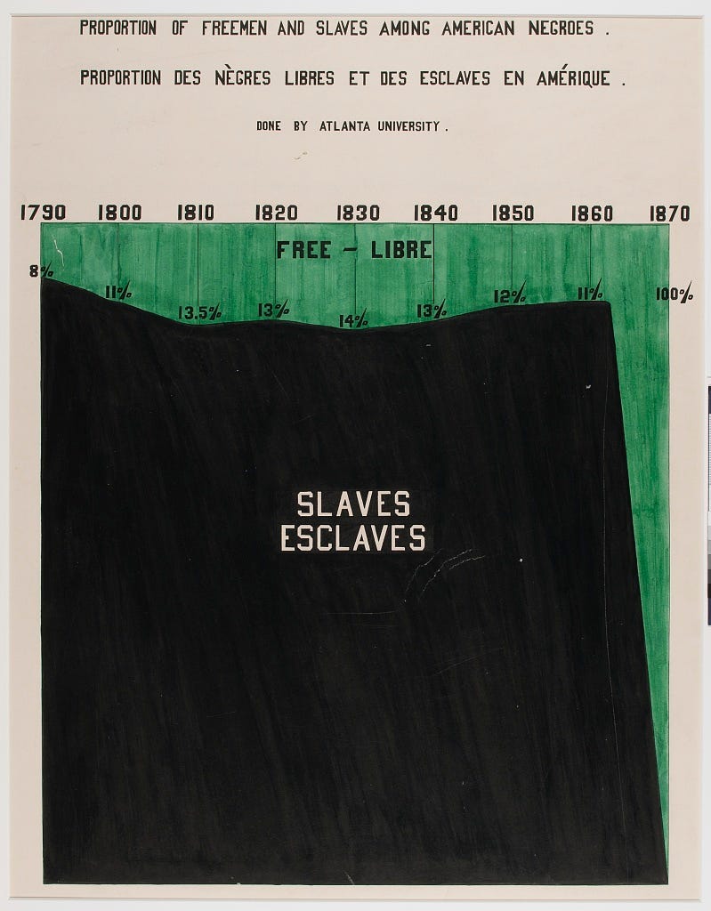
For a teaser of these Du Boisian resources, here a few Du Bois charts ranging from simple to complex — but all visually compelling and effective models of science communication. This first chart shows how Black enslavement in the US increased in the run up to the US civil war and emancipation:
Another simple graph shows how Black illiteracy in Georgia declined from 99% before emancipation in 1860 to just 50% in 1900.

Here, a third simple bar graph shows that Black illiteracy by 1900 had fallen below that some European nations where serfdom persisted long into the 1800s.

And a final example for here, the Du Bois spiral, a creative solution to plot the exponential rise in Black household wealth from Reconstruction in 1875 to 1900:
